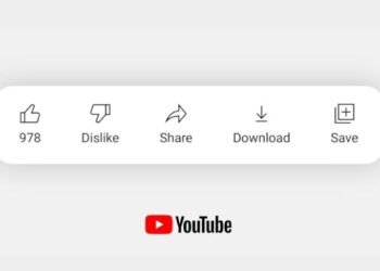
The most popular video player app in the world has now got a new UI redesign. The full screen mode of YouTube now have more options. These options let you like or dislike a video without coming out of the full video mode. In the previous update you could like or dislike when you swipe up on the full screen mode. The new UI will have some noticeable changes for both Android and iOS users.
In order to view these changes we should be going to full screen only. The vertical video player doesn’t have any changes in the update. Now you even get not only like and dislike but also share and view comments button in the full screen mode. When we click on the comments button we can see the comments on the full screen without covering the video. It will push the video to a side and you can view the comments without any disturbance on the video.
YouTube has a new Video Player UI on mobile devices now (being rolled out on both Android & iOS devices), with direct access to buttons like Like/Dislike, Sharing, and Comments. #YouTube pic.twitter.com/lbfVk8ksTu
— Ishan Agarwal (@ishanagarwal24) February 1, 2022
Now there might be question as if all there buttons come to the full screen will there be any disturbance in the viewing. For this YouTube has followed a slim icon design where the icons will be slim with very thin outline. Another change you can notice is the settings gear icon on the top right corner. This used to be the three dots to open the menu that is used for selecting the video quality, speed, captions and all. Now we will get the same options but with a new icon on the full screen mode. This update is being rolled out to all the Android and iOS devices in a phased manner and will reach all users by the month ending.
So, that’s been it. Thank you for reading, and do share the article if you get a bit of information. Also, keep an eye on this space for more relevant updates. Stay safe, and we hope to see you around.


